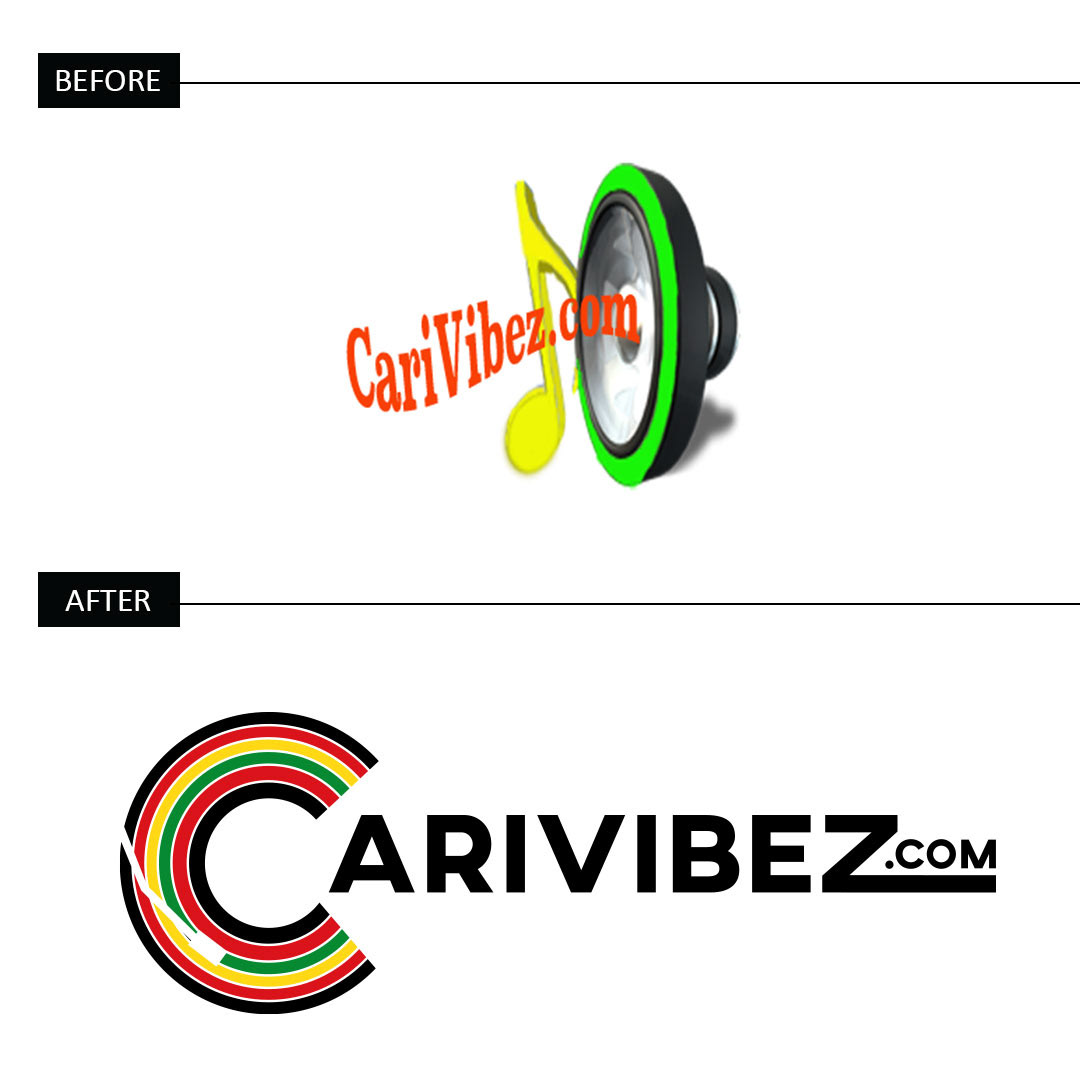
The Logo
The goal was to improve legibility, fine tune the color palette, and create something timeless that can be used for years to come. The client requested the use of Rastafarian colors; red, green, and gold. The current musical element felt outdated, so the C in Carivibez was transformed into an old school turntable with a needle. I hesitated to use the .com in the logo but the client insisted. To accommodate this, I manipulated the Z to make the ".com'' portion of the logo fit in seamlessly.